
To create a distraction-free landing page, focus on simplicity and clarity by eliminating unnecessary elements, using a clean layout, and highlighting your main call-to-action. Minimalism helps guide visitors’ attention directly to what matters most, increasing conversions and engagement. Keep the design uncluttered, use ample white space, and choose a clear, compelling message that speaks directly to your audience’s needs.
Designing a landing page with no distractions is all about stripping away anything that doesn’t serve your goal. Use a simple, tidy layout with a single focus point, like your main offer or sign-up button. Limit navigation options and avoid cluttered visuals to ensure visitors stay focused on the intended action. By prioritizing clarity and purpose, you can guide users smoothly toward your desired outcome, boosting the effectiveness of your campaign.

How to Design Landing Pages with No Distractions
Creating a landing page that captures attention and encourages visitors to act can be tricky. The key is to reduce visual clutter and focus on what truly matters. Here, we will explore simple steps to design landing pages with no distractions that convert visitors into customers.
Understanding the Importance of a Distraction-Free Landing Page
A distraction-free landing page helps visitors stay focused on your main message. It removes unnecessary elements that can divert attention away from your call-to-action. When your page is clean and clear, visitors know exactly what to do next.
Reducing distractions also improves user experience. People prefer straightforward pages that are easy to navigate. Simplified design means less frustration and higher chances of conversion.
Start With a Clear Goal
Before designing, define what you want visitors to do. Is it signing up, making a purchase, or downloading a resource? Your entire design should revolve around this goal. Every element on the page must support that purpose.
Having a clear goal helps you decide which elements are necessary. Avoid including anything that does not lead visitors toward that action. This focus makes your landing page more effective.
Keep the Layout Simple and Focused
Use a Single Column Design
Single-column layouts are easier to scan and less distracting. They guide the visitor’s eyes down the page naturally. This format keeps the message clear and uncluttered.
Limit Visual Elements
Reduce the number of images and videos. Use only those that support your main message. Too many visuals can divert attention and slow page load times.
Maintain White Space
Whitespace, or empty space, helps highlight important elements. It prevents the page from feeling crowded and makes content easy to read. Use white space generously around headlines, text, and buttons.
Streamline Content for Clarity
Use Clear and Concise Headlines
Your headline should immediately tell visitors what you offer. Keep it simple, direct, and engaging. Avoid jargon or complex language.
Write Short Paragraphs and Bullet Points
Break information into digestible chunks. Short paragraphs are easier to scan. Bullet points organize benefits or features clearly, making them quick to understand.
Focus on Benefits, Not Features
Highlight how your offer helps the visitor. Benefits resonate more than technical details. Show the value they will gain by acting.
Design Effective Calls to Action
Make CTAs Stand Out
Your call-to-action button should be prominent. Use contrasting colors and place it above the fold. Clear, compelling text invites visitors to click.
Limit the Number of CTAs
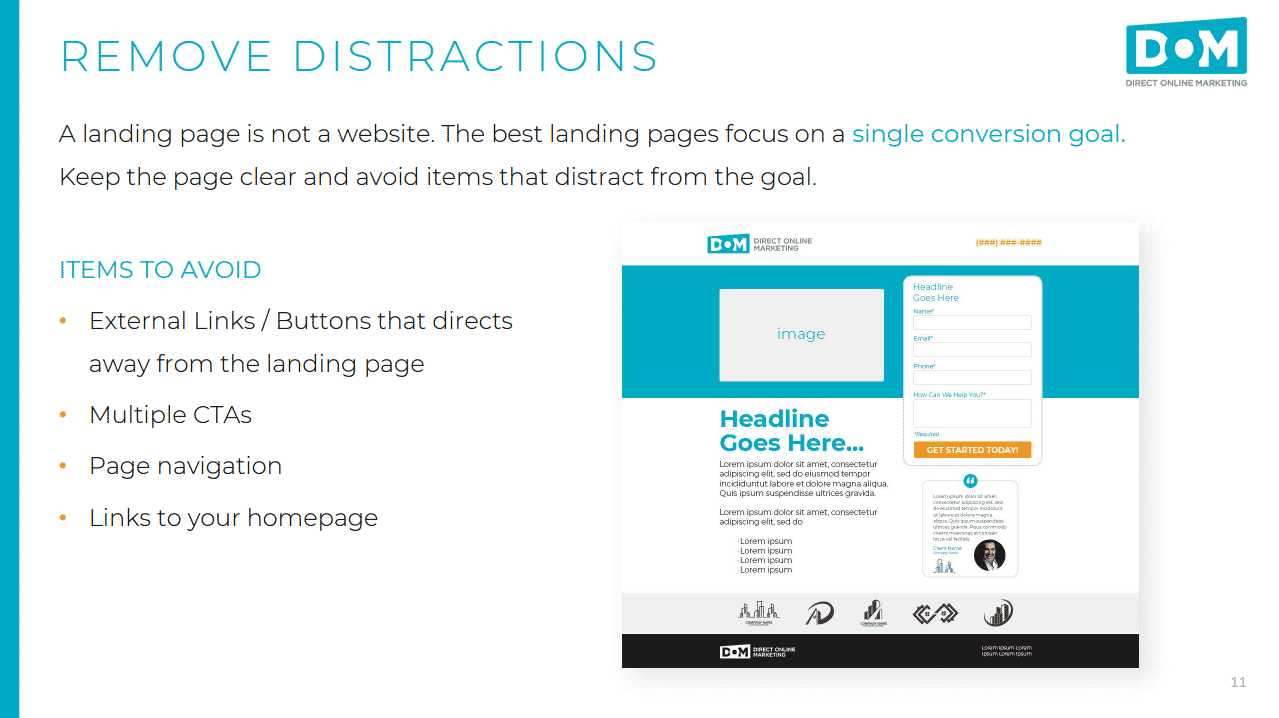
One main CTA per page keeps visitors focused. Multiple options can cause confusion and reduce conversion rates. Keep it simple with a single, strong CTA.
Use Action Words
Encourage immediate action with words like “Download,” “Register,” or “Buy Now.” Be direct and tell visitors what to expect when they click.
Reduce External Distractions
Minimize Navigation Menus
Remove or simplify navigation menus. Extra links can lead visitors away from the goal. A minimal menu or none at all keeps attention on the main offer.
Limit External Links
External links can distract visitors from your primary goal. Keep links relevant and limited to prevent them from wandering off the page.
Disable Pop-Ups and Auto-Play Media
Pop-ups and auto-play videos can interrupt the user experience. Use them sparingly, only if they add value. Such elements often pull attention away from the main message.
Optimize for Speed and Mobile Devices
Compress Images and Files
Large images slow down your page load. Compress files without losing quality to ensure fast loading times. Quick pages keep visitors engaged.
Ensure Mobile Responsiveness
Many visitors access pages via smartphones. Make sure your design adapts to different screen sizes. A clean, distraction-free mobile layout boosts engagement.
Test Load Times Regularly
Use tools like Google PageSpeed Insights to monitor performance. Fast-loading pages improve user experience and SEO rankings.
Use Consistent and Minimal Color Schemes
Choose a limited color palette that aligns with your branding. Use contrasting colors for important elements like buttons. Consistency helps keep the page visually clean.
A cluttered or bright color scheme can distract visitors. Keep colors subtle and purposeful to maintain focus.
Implement User-Friendly Typography
Select easy-to-read fonts and appropriate sizes. Limit font variations to create a unified look. Clear typography makes content accessible and reduces visual noise.
Test and Refine Your Design
Use A/B Testing
Compare different versions of your landing page to see what works best. Test headlines, colors, and CTA placements. This data-driven approach helps optimize for conversions.
Gather User Feedback
Ask real users about their experience. Use their insights to identify distractions or confusing elements. Continuous improvement leads to a more effective landing page.
Analyze Metrics Regularly
Monitor bounce rates, click-through rates, and conversions. These indicators reveal how well your page performs. Adjust your design based on these insights.
- Landing Page SEO: How to optimize your landing pages for search engines.
- Effective Copywriting: Writing persuasive content that encourages action.
- Visual Hierarchy: Using design elements to guide visitors’ attention.
- Conversion Rate Optimization: Strategies to increase the percentage of visitors who take action.
In summary, designing landing pages with no distractions involves focusing on simplicity, clarity, and purpose. Avoid clutter by limiting visual elements and external links. Keep content concise and direct visitors towards one main goal using a prominent call-to-action. Regular testing and refinement ensure your page remains effective and engaging for your audience.
We Looked At 3000 Landing Pages With Conversion Tracking Set Up
Frequently Asked Questions
What design choices help minimize visual clutter on a landing page?
Using clear and concise text, limiting the number of images and graphics, and maintaining ample white space can significantly reduce visual clutter. Focus on essential elements, eliminate unnecessary details, and ensure that each component directs attention towards the main call-to-action.
Limit navigation options to only the most important links or buttons. Avoid complicated menus or multiple paths that can distract visitors. Instead, direct users toward a single, clear action, guiding them smoothly through the experience without overwhelming choices.
What role does color selection play in reducing distractions?
Choose a color palette with minimal contrast and avoid using too many bright or flashy colors. Use colors strategically to highlight key elements, ensuring that they stand out without creating visual noise. Consistent and subdued tones help maintain a clean, focused appearance.
How can I structure content to keep attention on the main goal?
Organize content in a logical flow that naturally guides the viewer’s eye toward the primary message or call-to-action. Break information into digestible sections, use visual hierarchy with size and spacing, and avoid long paragraphs to maintain clarity and focus.
What are some common mistakes to avoid when designing distraction-free landing pages?
Avoid cluttered layouts, excessive use of animations or pop-ups, and placing multiple calls-to-action that compete for attention. Also, refrain from using overly complex fonts and background images that can divert focus from the main message. Keeping it simple ensures visitors stay engaged with the intended purpose.
Final Thoughts
Designing landing pages with no distractions requires focus on simplicity. Use a clear, concise message that guides visitors instantly. Limit visual clutter by removing unnecessary images and text. Prioritize a strong call-to-action that stands out.
Focus on clean layouts and minimal colors to keep attention on key elements. Test your design to ensure nothing diverts visitors from your main goal.
How to design landing pages with no distractions hinges on clarity and purpose. Keep the user experience straightforward and goal-oriented, leading to better engagement and conversion.
Recommended Email Marketing


