
To create eye-catching graphics for your posts, focus on bold colors, clear focal points, and simple but impactful designs. Use contrasting hues to grab attention, incorporate minimal text, and ensure your visuals align with your message. Consistency in style and quality will also boost recognition and engagement.
Designing captivating graphics is all about striking the right balance between creativity and clarity. Start by choosing vibrant colors that pop and ensure your main message or image stands out immediately. Keep your layout clean, avoiding clutter, and use high-quality images or illustrations. Play with fonts and sizes to make sure key information is easy to read. Remember, simplicity often makes a bigger impact than overly complicated designs. By paying attention to these elements, you’ll craft visuals that not only draw attention but also effectively communicate your message, encouraging viewers to engage with your posts.

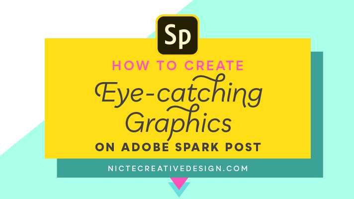
How to design eye catching graphics for posts
Understand Your Audience and Purpose
Creating graphics that attract attention begins with knowing who you are speaking to. Think about the demographics, interests, and preferences of your audience. Are they young students, professionals, or casual social media users? Knowing your audience helps you craft visuals that resonate with them.
Next, define the purpose of your post. Is it to inform, entertain, or promote a product? Clarity on your goal guides your design choices. For example, promotional graphics often need bold calls-to-action, while informational visuals prioritize clarity and simplicity.
Focus on Simplicity and Clarity
An eye catching graphic should be easily understood at a glance. Avoid cluttering your design with too many elements. Keep your message straightforward and visuals uncluttered to make it stand out.
Use a clear focal point to guide viewers’ attention. This could be a bold headline, a striking image, or a colorful shape. Maintain plenty of white space around key elements to enhance readability and impact.
Select the Right Color Palette
Colors play a crucial role in capturing attention. Bright, contrasting colors attract the eye but should be used carefully to avoid overwhelming the viewer. Choose a palette that aligns with your branding and evokes the right emotions.
Consider the psychology of colors. For example, red signifies urgency or excitement, while blue creates a sense of trust. Stick to 2-4 main colors to keep your graphic cohesive and visually appealing.
Use High-Quality Images and Graphics
Clear, sharp images instantly make your graphics more professional and engaging. Low-resolution or pixelated images reduce credibility and distract viewers.
Source images from reputable stock photo sites or create custom illustrations. Ensure that your images are relevant to your message and fit seamlessly with your overall design.
Implement Effective Typography
Text should be legible and complement your visual style. Use fonts that are easy to read on any device and avoid cluttering your graphic with too many different fonts.
Limit yourself to two or three font styles. Use bold or larger font sizes to emphasize important information. Pay attention to line spacing and alignment to keep your text neat and accessible.
Incorporate Visual Hierarchy
A well-structured graphic guides viewers naturally through the content. Use size, color, and placement to establish a hierarchy of information.
Place the most important message or headline at the top or center. Use contrast to highlight key points, making sure viewers know where to look first.
Use Shapes, Lines, and Icons Creatively
Adding geometric shapes, lines, and icons can make your design more dynamic. Shapes can help organize content and create a visual flow.
Icons are especially useful for conveying ideas quickly. Use them to add visual interest and support your message without cluttering the design.
Balance Your Composition
Achieving balance in your design helps keep it visually appealing. Distribute elements evenly and avoid crowding one side of the graphic.
Use the rule of thirds to position major elements along imaginary grid lines. This technique creates harmony and guides the viewer’s eye naturally across the graphic.
Leverage Contrast and Brightness
High contrast between text and background increases readability. Use dark text on light backgrounds or vice versa.
Adjust brightness and saturation to make your colors pop. Bright, vibrant graphics catch the eye faster than dull or muted tones.
Add Call-to-Action (CTA) Elements
Effective graphics often include a clear CTA to encourage engagement. Use buttons or bold text like “Learn More” or “Buy Now” to prompt actions.
Position CTAs strategically where viewers’ eyes naturally fall, ensuring they are noticeable but not overwhelming.
Stay Updated with Design Trends
Design trends evolve, so stay current to keep your visuals fresh and modern. Follow popular design blogs or social media accounts for inspiration.
Incorporate trending elements like gradients, minimalism, or illustrative styles where appropriate to appeal to contemporary audiences.
Use Design Tools and Software Effectively
Leverage user-friendly tools like Canva, Adobe Spark, or Figma to create professional-looking graphics. These platforms offer templates, fonts, icons, and drag-and-drop features.
Experiment with different features to find what works best for your needs. Save your designs in high resolution to ensure quality across platforms.
Test and Optimize Your Graphics
Before publishing, preview your graphics on different devices. Check for clarity, readability, and visual impact.
Gather feedback from colleagues or friends and make adjustments as needed. Use analytics to see which graphics perform best and refine your approach over time.
Maintain Consistency Across Your Visuals
Create a style guide that includes color schemes, fonts, and layout preferences. Consistent branding makes your posts immediately recognizable.
Apply the same style to all graphics to establish a cohesive look. This consistency builds trust and reinforces your identity.
Incorporate Trends While Maintaining Originality
While it’s good to follow design trends, always add your unique touch. Personalize templates and elements to reflect your brand personality.
Originality helps your graphics stand out in a crowded digital space, making viewers more likely to engage.
Study Successful Examples
Analyze popular graphics from brands and influencers you admire. Note what makes their visuals effective – color choices, layout, fonts, or imagery.
Apply these insights to your own designs, adapting them to fit your message and audience.
Designing eye catching graphics for posts involves a mix of understanding your audience, choosing appealing visuals, and applying clear principles of design. Keep it simple, use captivating colors, and ensure your message is easy to read. Use design tools and stay updated with current trends to keep your content fresh. Remember, consistent quality in your visuals makes a lasting impression and drives engagement.
🔸 Master ADVANCED Hierarchy In Under 7 Minutes! (Important)
Frequently Asked Questions
What are some tips for selecting effective color schemes in post graphics?
Choose color schemes that match your brand identity and evoke the desired emotions. Use contrasting colors to make elements stand out and ensure readability. Limit your palette to a few harmonious hues to maintain a clean and professional look. Testing how your colors appear on different screens also helps in creating visually appealing graphics.
How can I incorporate typography that enhances the visual appeal of my posts?
Use clear and legible fonts that complement your overall design. Vary font sizes to create hierarchy, highlighting key information. Avoid cluttering your graphics with too many font styles; stick to two or three at most. Pay attention to spacing and alignment to improve readability and give your design a polished feel.
What techniques can I use to create a sense of balance and focus in my graphics?
Apply the rule of thirds to position important elements strategically. Use visual hierarchy by emphasizing headlines or call-to-action buttons with size, color, or placement. Incorporate whitespace around key areas to prevent overcrowding and guide viewers’ eyes naturally toward the main message. Consistent alignment and spacing also help maintain harmony in your design.
How can I make my graphics stand out without overwhelming the viewer?
Focus on simplicity by limiting the number of elements and avoiding clutter. Use bold visuals or contrasting colors sparingly to draw attention. Incorporate focal points like icons or images that relate directly to your message. Ensuring a clear and straightforward layout helps viewers quickly grasp your information without feeling overwhelmed.
Final Thoughts
Designing eye catching graphics for posts requires clear visuals and bold colors to grab attention immediately. Use contrasting hues to make key elements stand out and ensure text is readable. Keep the design simple yet impactful to communicate your message quickly.
Focus on creating a balanced layout that guides the viewer’s eye naturally across the graphic. Incorporate relevant images or icons to enhance the visual story.
In summary, how to design eye catching graphics for posts involves clarity, contrast, and simplicity. Prioritize these elements to make your graphics memorable and effective.