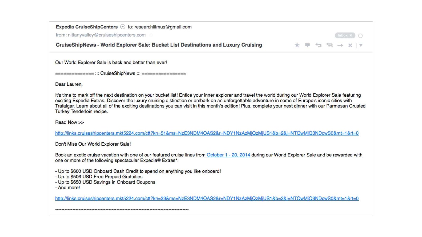
To make your emails clear and easy to read, use simple formatting techniques like short paragraphs, bullet points, and clear headings. Choosing readable fonts, adequate spacing, and highlighting important points with bold or italics can also boost comprehension. Proper formatting ensures your message is understood quickly and leaves a professional impression.
Effective email formatting transforms a cluttered, confusing message into a polished communication that captures attention and delivers your message effortlessly. In this article, you’ll learn practical tips on how to organize your text, choose the right fonts, and use visual cues to enhance readability. Whether you’re sending a quick update or a detailed report, mastering these formatting tricks can make your emails more engaging and accessible for recipients.

How to Format Text for Better Readability in Emails
Clear and easy-to-read emails help your message come across effectively. Properly formatting your text ensures your readers understand your message quickly and without confusion. In this guide, we will explore how to make your emails more readable through smart formatting techniques.
Prioritize Clear Structure with Headings and Subheadings
Headings break your email into sections, making it easier for readers to scan the content. Use descriptive headings that summarize the main idea of each part. This helps your audience find the information they need without sifting through large blocks of text.
Using subheadings (
and below) can further organize your points. For instance, under a main heading about project updates, subheadings could specify tasks, deadlines, or requests. This layered approach makes your email look tidy and professional.
Use Short Paragraphs and Sentences
Long paragraphs can overwhelm readers and discourage them from engaging with your message. Keep paragraphs to three to four sentences. This makes your email appear less dense and more inviting.
Similarly, sentences should be concise and direct. Aim for simple sentences that communicate one idea each. These small units make your message easy to process, especially on mobile devices.
Implement Bullet Points and Lists Effectively
Bullet points help present information clearly and attractively. Use
- for lists that contain at least three items, such as key points, steps, or benefits. Lists improve skimming, allowing readers to grasp essential details at a glance.
- Use active voice: Keep sentences lively and straightforward.
- Avoid jargon: Use simple words that your audience understands.
- Limit bolding and italicizing: Use emphasis strategically to guide rather than distract.
Numbered lists are ideal for instructions or sequences, guiding the reader through each step. Ensure each list item is brief but informative, enhancing overall clarity.
Choose Readable Font Styles and Sizes
Opt for easily legible fonts like Arial, Calibri, or Verdana. Use a font size of at least 12 pixels to ensure readability across devices. Avoid decorative fonts that can be difficult to read or seem unprofessional.
Consistent font styles and sizes help your email look uniform and organized. Use bold for emphasis and italics sparingly to highlight important points without cluttering the layout.
Utilize Proper Line Spacing and Margins
Line spacing (or leading) significantly impacts readability. Use a line height of 1.15 to 1.5 times the font size, creating enough space between lines. Adequate spacing prevents text from appearing cramped.
Set margin widths generously around your text blocks. This whitespace creates visual breathing room and makes your email look clean and professional.
Highlight Key Information with Bold and Italics
Use bold text to emphasize vital points, such as deadlines, contact info, or calls to action. Italics can draw attention to specific words or phrases but should be used sparingly.
Avoid overusing these styles, as cluttered formatting reduces their impact. Thoughtful emphasis guides the reader’s focus and improves overall comprehension.
Incorporate Visual Elements and Spacing
Adding images, icons, or separators can make your email visually appealing. Use horizontal lines (
) or spacing to divide sections, making the content easier to navigate.
Ensure images are relevant and optimized for quick loading. Visual breaks prevent monotony and keep readers engaged from start to finish.
Choose Appropriate Text Colors and Backgrounds
Stick to high-contrast color schemes, such as black text on white backgrounds, for maximum readability. Avoid bright or neon colors that strain the eyes.
Maintain a consistent color palette throughout your email to reinforce branding and create visual harmony. Use color sparingly for highlights or links rather than entire sections.
Optimize Email Layout for Mobile Devices
Most users view emails on their smartphones, so responsive design is essential. Use single-column layouts that adapt to smaller screens.
Ensure font sizes and buttons are large enough for easy tapping and reading. Test your email on multiple devices to confirm formatting remains intact and accessible.
Test and Preview Before Sending
Always preview your email to catch formatting issues or errors. Use tools that allow you to see how your email appears across various email clients and devices.
Make adjustments as needed, paying close attention to font size, spacing, and overall readability. A well-prepared email reduces frustration and increases engagement.
Maintain Consistency in Formatting
Consistency helps your email look professional and trustworthy. Use the same font, size, and style for similar sections or headings.
Create a template if you regularly send similar emails. This ensures your formatting stays uniform and saves time while maintaining quality.
Additional Tips for Readability
By practicing these formatting techniques, you can craft emails that are not only visually appealing but also easy to read and understand. Making small adjustments can significantly boost your email communication success.
3 Quick Email Formatting Fixes to Improve Readability
Frequently Asked Questions
What are effective ways to emphasize important points in an email?
Use bold or italics to highlight key information and ensure it stands out. Incorporate bullet or numbered lists to organize main ideas clearly. Additionally, spacing out sections with line breaks helps important details catch the reader’s eye and improves overall clarity.
How can I improve the layout of my email for better readability?
Use a clean and simple format with consistent font types and sizes. Break text into short paragraphs and include headings or subheadings to segment different topics. Incorporate white space around sections to prevent clutter and make it easier for readers to scan the content quickly.
What role does font choice and size play in email readability?
Select clear, professional fonts such as Arial, Calibri, or Verdana set at a size between 10 and 12 points. Avoid decorative fonts or excessively small or large text, as these can strain the eyes or make the email look unprofessional. Proper font choices contribute significantly to the ease of reading your message.
How can I use color effectively in my email to enhance understanding?
Apply color sparingly to highlight links or key points, ensuring high contrast with the background for readability. Avoid overusing bright or multiple colors, which can be distracting. Consistent use of color to denote specific types of information helps readers quickly identify important sections.
What are some best practices for aligning and organizing email content?
Align text uniformly, usually to the left, to create a neat presentation. Use headers and subheaders to structure your email logically. Incorporate spacing between sections and margin adjustments to prevent overcrowding. These practices guide the reader smoothly through your message and improve overall comprehension.
Final Thoughts
How to format text for better readability in emails is vital for clear communication. Use headings, bullet points, and numbered lists to organize information effectively. Keep paragraphs short and focused to avoid overwhelming the reader. Highlight important points with bold or italics to draw attention. These techniques make emails easier to scan and understand, ensuring your message is received as intended.