
To effectively incorporate brand elements into your email design, start by consistently using your logo, color palette, and typography throughout the email. Make sure these elements align with your overall brand identity to create a cohesive and recognizable message. Use visual cues like icons and imagery that reflect your brand style to reinforce recognition and trust. Personalize content with your brand voice to build a stronger connection with your audience.
In short, integrating brand elements into email design involves consistent use of your logo, colors, fonts, and imagery that reflect your brand identity. This not only makes your emails visually appealing but also enhances brand recognition and trust among your audience.
Captivating your email recipients starts with making your emails instantly recognizable. When your brand elements are seamlessly woven into your email design, it creates a professional look that reinforces your identity and sets you apart from competitors. Consistent branding in every email builds familiarity, trust, and loyalty, turning casual readers into loyal customers. Whether it’s your logo, signature colors, or unique typography, using these elements thoughtfully ensures your message resonates and leaves a lasting impression.

How to Use Brand Elements in Email Design
Understanding the Importance of Brand Elements
Brand elements are visual and textual features that define your company’s identity. They include your logo, color palette, typography, imagery style, and tone of voice. Incorporating these consistently in emails helps your audience recognize your brand instantly.
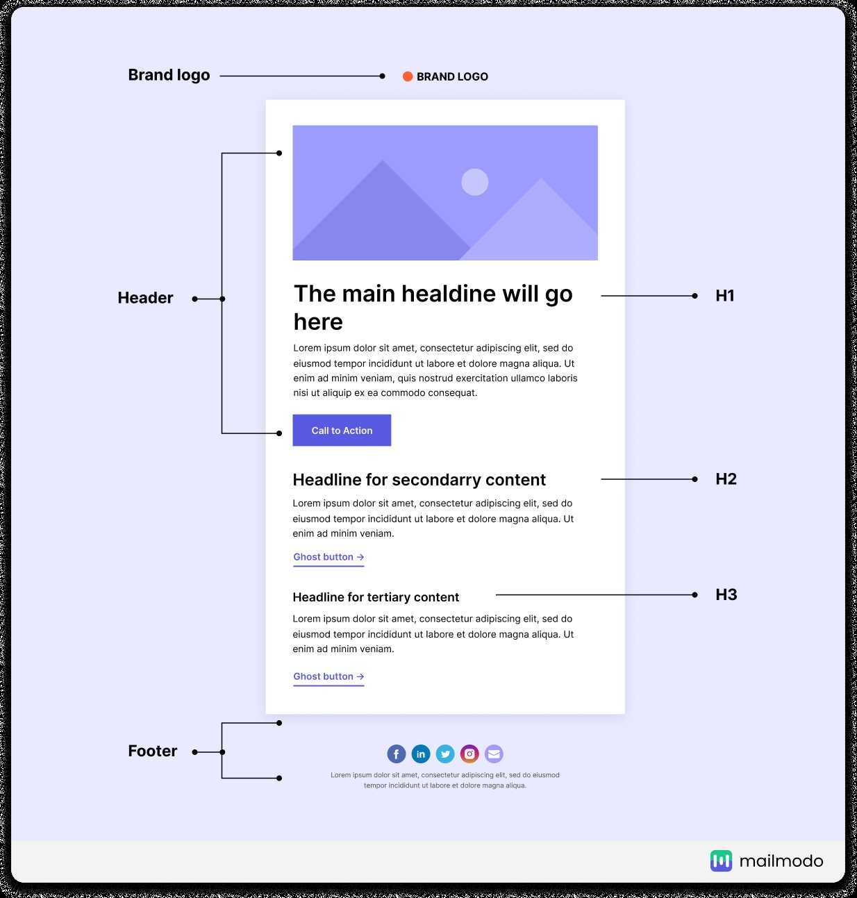
Logo Placement for Brand Recognition
Your logo acts as the face of your brand. Position it prominently at the top of your email for immediate visibility. Keep it clear and high-resolution to maintain a professional look. Using your logo consistently across campaigns boosts brand recall.
Size and Proportion Tips
Ensure your logo is neither too large nor too small. A good rule is to make it about 20% of the header space. This balances visibility with the overall email layout without overwhelming other content.
Using Color to Reinforce Your Brand Identity
Colors evoke emotions and set the tone of your messages. Use your brand’s primary color palette in your email backgrounds, buttons, and accents. This consistency helps reinforce your brand image and creates visual harmony.
Color Contrast and Accessibility
Choose contrasting colors to ensure your message is easy to read. Consider accessibility guidelines to accommodate all users, including those with visual impairments. Use tools like contrast checkers to evaluate color combinations.
Typography Choices that Match Your Brand Voice
Select fonts that reflect your brand’s personality. For a playful brand, choose friendly, rounded fonts; for a professional one, opt for clean and simple typefaces. Maintain consistency by using the same fonts throughout your emails.
Hierarchy and Readability
Create visual hierarchy by varying font sizes and weights for headings, subheadings, and body text. Use ample line spacing and avoid clutter to make your emails easy to scan and read.
Imagery Style and Visual Elements
Use imagery that aligns with your brand’s style — whether it’s photography, illustrations, or icons. Consistent visual themes make your emails more recognizable and engaging.
Brand-Consistent Photos and Graphics
Choose images that reflect your brand’s tone and target audience. For example, a health brand might use bright, energetic images, while a luxury brand might opt for elegant, muted visuals.
Tone of Voice in Email Content
Your text should sound like your brand. Whether friendly, professional, or witty, use language that resonates with your audience. Consistent tone builds trust and familiarity over time.
Writing Style Tips
Use simple sentences, active voice, and clear calls to action. Personalize your messages where possible to strengthen your connection with recipients.
Creating a Cohesive Email Layout
Design your emails with a consistent style that reflects your brand. Use templates that incorporate your visual elements, ensuring every email feels unified and professional.
Layout Best Practices
Use a single-column layout for clarity and mobile friendliness. Include ample white space to prevent clutter. Place key elements, like call-to-action buttons, in visible spots.
Consistency Across Campaigns
Maintain your brand style across all emails to build recognition. Create a branding guide that specifies colors, fonts, logo usage, and imagery standards.
Branding Guide Benefits
A style guide ensures all team members and agencies follow the same standards, keeping your brand identity strong and uniform.
Using Interactive Elements that Align with Your Brand
Interactive features like buttons, reply prompts, or embedded videos should match your visual style and tone. They should enhance user engagement without disrupting your brand consistency.
Design Tips for Interactive Components
Use branded colors and fonts for buttons. Keep messaging clear and aligned with your voice. Ensure all interactive elements function smoothly on mobile devices.
Testing Your Email Design for Brand Consistency
Before sending, review your emails on multiple devices and email clients. Check that logos, colors, fonts, and images appear correctly across platforms.
Usability and Visual Checks
Ensure that your brand elements are visible and consistent. Fix any discrepancies to maintain professionalism and brand integrity.
Monitoring and Updating Your Brand Elements
Regularly review your email campaigns to ensure brand standards are maintained. Update your branding materials as your brand evolves.
Feedback and Data Analysis
Use analytics to see which designs resonate most. Gather feedback from your audience and team to refine your branding in emails over time.
—
Incorporating your brand elements thoughtfully in email design creates a strong visual identity that resonates with recipients. Consistency in logo placement, color choices, typography, imagery, and tone cultivates brand recognition and trust. By adhering to these best practices, you make every email a true reflection of your brand, driving engagement and loyalty.
7 Essential Elements of Email Design #shorts
Frequently Asked Questions
How can I ensure my brand colors are effectively incorporated in email designs?
Choose your primary and secondary brand colors carefully and use them consistently throughout your email. Incorporate these colors into backgrounds, buttons, headers, and text to reinforce brand identity. Ensure sufficient contrast for readability and avoid overusing vibrant colors that may overwhelm the viewer. Maintaining color consistency helps recipients quickly recognize your brand and creates a cohesive visual experience.
What role do brand fonts play in designing emails, and how should I select them?
Select fonts that align with your brand’s personality and are easy to read across various devices. Use your brand’s primary font for headings and important text, while opting for complementary fonts for body copy if necessary. Limit the number of fonts in your email to maintain clarity and avoid visual clutter. Consistent font use reinforces your branding and enhances professionalism in email communication.
How should I incorporate logo placement without disrupting the email layout?
Place your logo prominently at the top of the email, typically in the header, to establish brand recognition immediately. Ensure the logo size balances visibility without overpowering the content. Maintain sufficient whitespace around the logo to prevent clutter and ensure it remains clear on all devices. Proper placement helps recipients associate the content with your brand instantly, building trust and familiarity.
What are effective ways to utilize brand imagery in email campaigns?
Select images that reflect your brand’s style, tone, and message. Use high-quality visuals that complement your color palette and design elements. Incorporate branded graphics, product photos, or lifestyle images that resonate with your audience. Consistent imagery helps communicate your brand story and creates a cohesive look across all email communications.
How can I maintain brand consistency across multiple email campaigns?
Develop a set of brand guidelines covering colors, fonts, logo usage, and image style. Use templates that adhere to these standards to ensure uniformity in every campaign. Regularly review your emails to confirm they align with your branding rules, and update your assets as needed. Consistency reinforces your brand identity and builds familiarity with your audience over time.
Final Thoughts
Using brand elements in email design ensures consistency and reinforces brand identity. Incorporate logos, color schemes, and fonts thoughtfully to create a cohesive look. This familiarity builds trust and recognition with your audience.
Focus on placement and size to maintain clarity without overwhelming the message. Ensure each element aligns with your overall branding strategy.
How to use brand elements in email design effectively enhances visual appeal and brand memorability. Apply these principles consistently to make your emails stand out and resonate with recipients.