

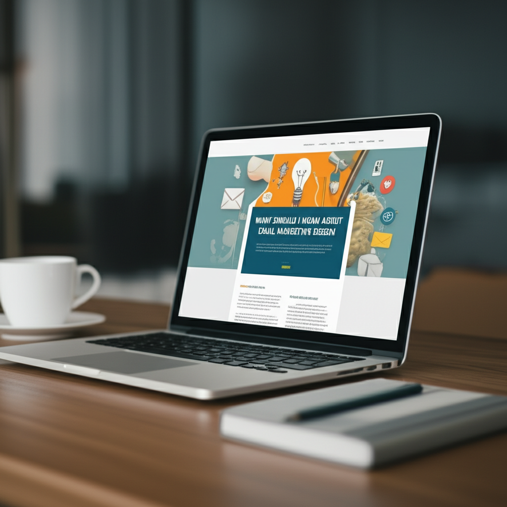
Email marketing design is all about making your emails look good and easy to read so people want to open them and click. It means using simple layouts, clear text, and nice pictures to grab attention and guide readers.
Hey there! So, you’re diving into email marketing? That’s awesome! It’s like sending little friendly notes to people who want to hear from you. But sometimes, when you think about making those emails look good, it can feel a bit… well, complicated. You see fancy emails everywhere and wonder, “How do I even start?”
Don’t worry one bit! We’re going to break down email marketing design into super simple steps. Think of it like setting up a cozy corner for your friends to visit. We’ll make sure your emails are inviting, clear, and totally delightful.
By the end of this, you’ll know exactly what makes an email design shine. You’ll feel confident creating emails that people actually want to open and read. Ready to make your emails look amazing?
Why Email Design Matters So Much
Think about your own inbox. What catches your eye? Usually, it’s an email that looks clean and interesting, right? Good design isn’t just about looking pretty. It’s about making it super easy for your readers to get your message.
When your email looks good, people trust you more. They feel like you’re professional and you care about them. This helps them want to click your links and learn more about what you offer.
Bad design, on the other hand, can make people feel confused or even like they can’t trust you. They might just hit delete before they even read a word!
Your Email Design Checklist: The Essentials
Let’s get down to what really makes an email design work. It’s like having a secret recipe, but it’s super easy to follow!
1. Keep It Simple and Clean
Imagine walking into a messy room. It’s hard to find what you’re looking for, right? Your email is like that room for your message.
- Less is More: Don’t cram too much into one email. Stick to one main goal.
- White Space is Your Friend: Give your text and images room to breathe. This makes it easier to read.
- Clear Layout: Use simple blocks for text, images, and buttons. People’s eyes like order!
2. Make It Easy to Read
This is super important! If people can’t read your email easily, they’ll leave.
- Font Choice: Use easy-to-read fonts like Arial, Helvetica, or Georgia. Stick to one or two fonts at most.
- Font Size: Make sure the text is big enough. Around 14-16 pixels for the main text is usually good.
- Contrast: Use dark text on a light background. This is the easiest for eyes to see.
- Short Paragraphs: Break up big chunks of text. One to three sentences per paragraph is perfect.
3. Mobile-First Design is Key
Most people check their email on their phones. So, your email must look great on a small screen.
- Single Column Layout: This is the easiest for phones. Everything stacks nicely from top to bottom.
- Big Buttons: Make sure your buttons are large enough to tap with a thumb.
- Readable Text: Again, font size and contrast matter even more on mobile.
- Test on Mobile: Always send a test email to your phone before sending it out to everyone.
4. Use Images Wisely
Pictures can make your email pop! But don’t overdo it.
- Relevant Images: Use photos or graphics that match your message.
- Good Quality: Blurry or pixelated images look unprofessional.
- Alt Text: Always add “alt text” to your images. This is a short description that shows up if the image doesn’t load, or for people using screen readers. It helps them understand what the image is.
- File Size: Big image files can slow down your email loading. Try to keep them reasonably sized.
This is what you want people to do. Buy something? Read a blog post? Sign up for a webinar?
- Make it Obvious: Use a button, not just a text link.
- Clear Wording: Say exactly what will happen when they click. “Shop Now,” “Read More,” “Download Free Guide.”
- Contrasting Color: Make the button color stand out from the rest of the email.
- One Main CTA: Try to have just one main button per email to avoid confusion.
6. Branding Consistency
You want people to recognize your emails, right?
- Your Logo: Put your logo at the top.
- Brand Colors: Use your brand’s colors for buttons, links, or headings.
- Consistent Tone: Keep your writing style the same as on your website or social media.
Design Do’s and Don’ts: A Quick Guide
Here’s a handy table to help you remember the best practices.
| Do This! 👍 | Avoid Doing This! 👎 |
|---|---|
| Use simple, readable fonts. | Use fancy fonts that are hard to read. |
| Keep paragraphs short. | Write long blocks of text. |
| Have a clear call-to-action button. | Have too many links or no clear next step. |
| Make sure it looks good on mobile. | Only design for a desktop computer. |
| Use white space generously. | Cram everything together. |
| Test your email before sending. | Send without checking how it looks. |
Making Your Emails Accessible
Accessibility means making sure everyone can enjoy and understand your emails, no matter their abilities. This is super important and makes you look even better!
- Alt Text for Images: We talked about this! It helps visually impaired people understand your images.
- Semantic HTML: This sounds techy, but email builders do it for you! It means using headings correctly so screen readers can navigate your email.
- Color Contrast: Make sure there’s enough difference between text and background colors.
- Avoid Flashing/Moving Content: Unless it’s crucial and handled carefully, it’s best to skip animations that can be distracting or cause problems.
Choosing the Right Email Marketing Tool
You don’t have to build emails from scratch! Most email marketing services have amazing tools to help you design.
These tools often have pre-made templates that you can easily customize. They are built with best practices in mind, so you’re already off to a great start!
Here are a few popular ones that beginners love:
| Tool Name | What Makes it Great for Beginners | Good For |
|---|---|---|
| Mailchimp | Very user-friendly interface, lots of templates, great for small businesses. | Getting started, simple newsletters, small e-commerce. |
| MailerLite | Clean interface, generous free plan, easy automation. | Bloggers, small businesses, those looking for a good free option. |
| ConvertKit | Focuses on creators, easy automation, simple design. | Bloggers, authors, online course creators. |
| Sendinblue (now Brevo) | Offers email, SMS, and chat in one, good automation. | Businesses needing multiple communication channels. |
Many of these offer free plans to start! It’s a fantastic way to learn and grow without spending money.
Where to Learn More
Want to dive deeper? These resources are super helpful:
- HubSpot Academy: They have tons of free courses on email marketing, including design tips. Check out HubSpot Academy.
- Mailchimp’s Blog: Mailchimp has lots of articles and guides specifically about email design.
FAQ: Your Burning Questions Answered
Let’s tackle some common questions beginners have about email design.
How can I start email marketing with no money?
Great question! Many email marketing services offer free plans for beginners. MailerLite and Mailchimp, for example, let you send emails to a certain number of subscribers for free. You can also start by collecting emails on your website or social media and using these free plans to send out your first newsletters!
How do I write subject lines people click?
Subject lines are your first impression! Keep them short, clear, and intriguing. Use emojis if they fit your brand! Ask a question, create curiosity, or highlight a benefit. For example, “Did you see this?” or “Your weekly dose of awesome is here!”
How often should I email my list?
There’s no single answer, but consistency is key! Start with once a week or once every two weeks. The most important thing is to send emails that your subscribers find valuable. If you’re sending great content, people will want more!
How do I know if my email is working?
Your email marketing tool will show you key numbers! Look at the “open rate” (how many people opened your email) and the “click-through rate” (how many people clicked a link). These numbers tell you what’s resonating with your audience. Don’t worry too much about perfect numbers at first, just aim to improve over time!
How do I stop my emails from going to spam?
First, only email people who have given you permission to email them! Second, use a reputable email marketing service. Third, make sure your emails are well-designed, not too salesy, and have clear content. Using a strong subject line that isn’t misleading also helps a lot.
Should I use a template or design from scratch?
For beginners, using a template is almost always the best choice! Email marketing platforms provide templates that are already designed to be mobile-friendly and easy to read. You can then customize them with your own colors, logo, and images. Designing from scratch is much more complex and usually not necessary.
What is an email template and why use one?
An email template is like a pre-designed blueprint for your email. It has the layout, sections for text, images, and buttons already set up. You just fill in your own content! Using a template saves you tons of time and ensures your email looks professional and works well on any device.
Putting It All Together: Your Next Steps
See? Email marketing design isn’t some scary monster. It’s just about being thoughtful and clear.
You’ve learned how to keep things simple, make your text easy on the eyes, make sure your emails work on phones, and use images and buttons effectively. You also know where to find tools and learn more.
The best way to get good at this is to just start! Pick an email marketing tool, choose a template, and start creating. Send a test email to yourself and see how it looks. Make a small change, send another test. You’ll get the hang of it super fast!
Remember, each email is a chance to connect with your audience. Make it a good one! You’ve got this, and I’m excited to see what you create!