
Creating emails that look perfect on any device might seem tricky, but it’s absolutely doable with the right approach. The key is to use responsive design techniques that automatically adapt your email layout to fit screens of all sizes, from desktops to smartphones. Start with a flexible template, keep your content simple, and test thoroughly before hitting send to ensure your message looks great everywhere.
In short, designing emails that work across all devices involves using responsive coding, clean layouts, and rigorous testing. This way, your subscribers enjoy a seamless experience whether they open your email on a tiny phone or a large monitor, boosting engagement and delivering your message effectively every time.
Crafting emails that display beautifully on any device is essential in today’s mobile-first world. With people checking their emails on the go more than ever, your message must be visually appealing and easy to read across all screens. Incorporating responsive design from the start, using mobile-friendly fonts, images, and easy-to-click buttons ensures your emails are universally accessible. Plus, testing your emails across multiple devices and email clients helps catch any issues before your campaign reaches your audience. By prioritizing these techniques, you guarantee your emails make a strong impression and achieve your marketing goals, no matter how your recipients access their inbox.

How to Design Emails That Work Across All Devices
Creating emails that display perfectly on every device can seem challenging. With people checking their emails on smartphones, tablets, and desktops, your design must adapt seamlessly. The key is understanding the principles of responsive email design and applying best practices to provide a consistent experience.
Understanding Responsive Email Design
Responsive design means your email layout adjusts based on the device’s screen size. It ensures that your content remains readable and engaging no matter how viewers access it. This involves flexible layouts, scalable images, and adaptable typography.
Responsive emails use a combination of HTML and CSS techniques. These include media queries, flexible grid systems, and fluid images. Using these tools helps your emails look professional and consistent across all platforms.
Why Responsive Design Matters
Most emails are opened on mobile devices. Studies show that over 50% of emails are read on smartphones. If your emails are not optimized, they may appear cluttered or difficult to read, leading to lower engagement rates.
Designing for all devices boosts user experience and increases click-through rates. It also helps build trust with your audience by showing you care about how your content appears.
Key Elements for Multi-Device Email Design
- Flexible Layouts: Use percentage-based widths instead of fixed pixels to allow content to resize automatically.
- Scalable Images: Incorporate images that scale without losing quality, ensuring they look good on small and large screens.
- Readable Typography: Choose font sizes that are legible on all devices, typically between 14px and 22px.
- Clear Call-to-Actions: Make buttons and links large enough to tap easily on touchscreen devices.
- Minimalist Design: Avoid clutter, keeping your message simple and focused for quick comprehension.
Implementing Responsive Layouts with HTML and CSS
Start with a mobile-first approach, designing your email to look good on small screens before scaling up for desktops. Use meta viewport tags to control layout scaling on mobile browsers.
Employ fluid grid systems using CSS max-width and width: 100% properties. Wrap your content in div tags with percentage-based widths for flexibility.
Make use of media queries to target specific screen sizes, adjusting styles for tablets and desktops. For example, increase font sizes or add padding for larger screens to improve readability.
Optimizing Images for All Devices
Use max-width: 100% to ensure images resize within their containers. Incorporate multiple image sizes and supply appropriate srcset attributes for different device resolutions.
Compress images to reduce load times, especially for mobile users with slower connections. Choose the right format, such as JPEG for photographs and PNG for graphics with transparency.
Include alt text for all images—this improves accessibility and helps users understand content if images don’t load properly.
Designing Mobile-Friendly Call-to-Actions
Make sure your buttons are large enough to tap easily, typically at least 44×44 pixels. Use contrasting colors to make CTAs stand out visually.
Place your primary CTA above the fold so users see it immediately without scrolling. Keep the message clear and concise to encourage action.
Use whitespace around buttons to prevent accidental taps, especially on smaller screens.
Testing Your Responsive Email Designs
Always test your emails on multiple devices and email clients before sending. Use tools like Litmus or Email on Acid for cross-platform testing. These platforms simulate how your email appears across different screen sizes and apps.
Check for issues such as images not resizing, text overflowing, or buttons being too small. Fix any problems to ensure your email looks great everywhere.
Review email performance metrics regularly to see how your audience interacts with your messages. Use this data to iteratively improve your responsive design strategy.
Best Practices for Responsive Email Content
- Keep your subject line short and compelling for mobile screens.
- Use concise, engaging copy that is easy to scan.
- Prioritize important information and CTAs above the fold.
- Avoid heavy use of images that can slow loading times on mobile devices.
- Maintain a consistent color scheme and branding for recognition.
Additional Tips for Effective Cross-Device Email Design
- Use Friendly Fonts: Stick to web-safe fonts like Arial, Verdana, or Georgia for maximum compatibility.
- Limit the Use of Columns: Single-column layouts tend to work best on mobile devices. If you include multiple columns, make sure they stack vertically on small screens.
- Be Mindful of Load Times: Optimize your code and images to load quickly, especially on mobile networks.
- Maintain Consistency: Use a uniform style and layout across campaigns to foster brand recognition.
Tools and Resources to Aid Responsive Email Design
| Tool | Description |
|---|---|
| Litmus | Allows you to preview and test your emails across multiple devices and email clients. |
| Email on Acid | Offers comprehensive testing and analytics to optimize your email campaigns. |
| Mailchimp | Provides pre-designed responsive email templates for easy customization. |
| MJML | A framework that simplifies creating responsive emails with a markup language. |
Designing emails that work smoothly across all devices combines technical skills with a user-centered mindset. By focusing on flexible layouts, optimized images, and clear calls-to-action, you ensure your messages reach your audience effectively. Continual testing and refining help maintain high standards and improve engagement over time.
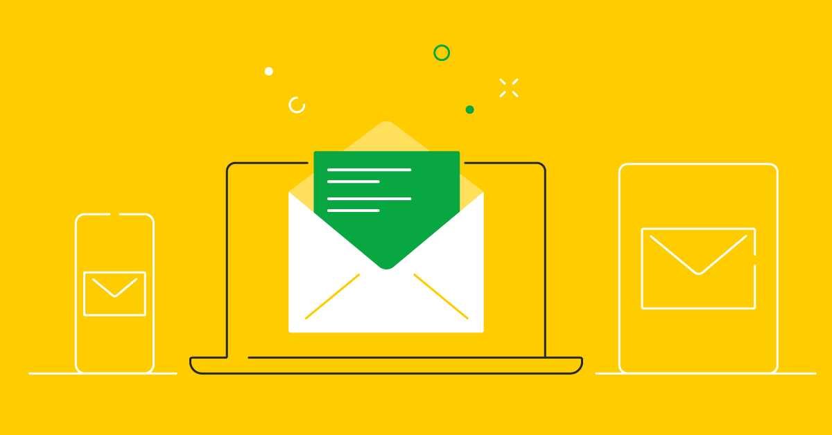
Designing emails for ALL devices.
Frequently Asked Questions
What layout strategies ensure emails display correctly on various screen sizes?
Using flexible grid layouts with percentage-based widths helps emails adapt seamlessly to different devices. Incorporate media queries to adjust styles based on screen size, and avoid fixed-width elements that can cause scrolling or layout issues. Testing your email across multiple devices confirms that your design remains consistent and user-friendly.
How can images be optimized for viewing on all devices?
Use responsive image techniques such as setting maximum width to 100% and height to auto, allowing images to resize according to the screen. Compress images to reduce load times without sacrificing quality. Include appropriate alt text to ensure accessibility if images don’t load properly.
What font choices improve readability across devices?
Select web-safe fonts with clear, legible sizes, typically between 14-16 pixels for body text. Keep font styles simple and avoid overly decorative fonts that may not render well on all devices. Use relative sizing units like rem or em to ensure consistency and adaptability.
How do media queries help in customizing email appearance for different devices?
Media queries detect device characteristics such as screen width and apply specific styling rules accordingly. This allows you to change font sizes, hide unnecessary elements, or adjust padding for smaller screens, ensuring your email remains visually appealing and easy to navigate across all devices.
What testing practices can ensure your email design works well everywhere?
Test your emails on various devices, email clients, and browsers before sending. Use tools like email preview services to see how your design renders on different screens. Make adjustments based on these tests, focusing on readability, image display, and overall layout consistency to enhance user experience.
Final Thoughts
Designing emails that work across all devices ensures your message reaches every reader effectively. Use a clear, responsive layout that adjusts seamlessly to different screen sizes. Keep your content concise and visuals optimized for quick loading. Focus on easy-to-read fonts and prominent call-to-action buttons. By implementing these strategies, you create an engaging experience on any device, increasing your email’s success rate.